01
Project Overview
The Partner Portal is a B2B platform that external partners use to work with AS3 — a system carrying complex workflows and dense operational data. Over time it had grown harder to navigate and no longer reflected how partners actually work.
The business goal was to modernize the portal: make it easier to use, more accessible, and structured around real partner tasks rather than the legacy system's internal logic.
The users are external business partners who rely on the portal to get work done. For them, the challenge was cutting through complexity to find the right information and complete workflows without friction.
02
My Role
I was the Lead UX Designer on the partner portal, owning the end-to-end design process from research and concept through information architecture, interaction design and validation.
I translated complex workflows and data into intuitive, accessible experiences, and facilitated workshops to align stakeholders on scope, priorities and direction.
- Discipline
- End-to-end UX & product design, information architecture
- Deliverables
- IA, Figma prototypes, UX specs & handover
- Team
- Product, developers, business & external partners
03
Discovery & Research
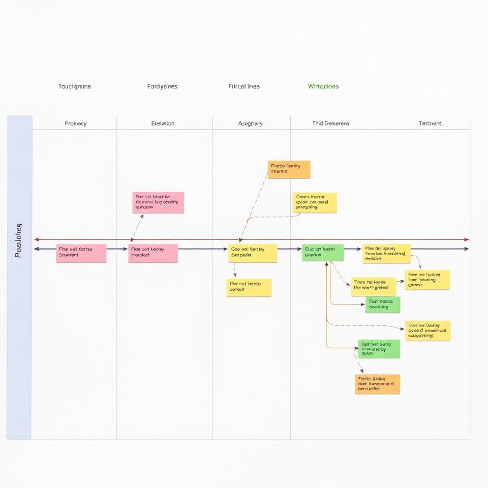
I started by understanding how partners actually used the existing portal and where the current structure created friction — mapping the workflows and data the platform needed to support.
I facilitated workshops with business stakeholders and subject-matter experts to surface constraints, edge cases and priorities early, grounding the redesign in real partner needs rather than assumptions.

04
Defining the Opportunity
The core opportunity was to re-structure the portal around how partners actually work — turning a dense, legacy-driven interface into a clear information architecture built on real tasks.
That framed a clear set of needs: partners needed to find and act on the right information quickly; the business needed a modern, maintainable platform; and the experience needed to stay accessible under real-world complexity.
- User need
- Find the right information and act without friction
- Business need
- A modern, maintainable B2B platform
- Success criteria
- Clear IA validated with real workflows
05
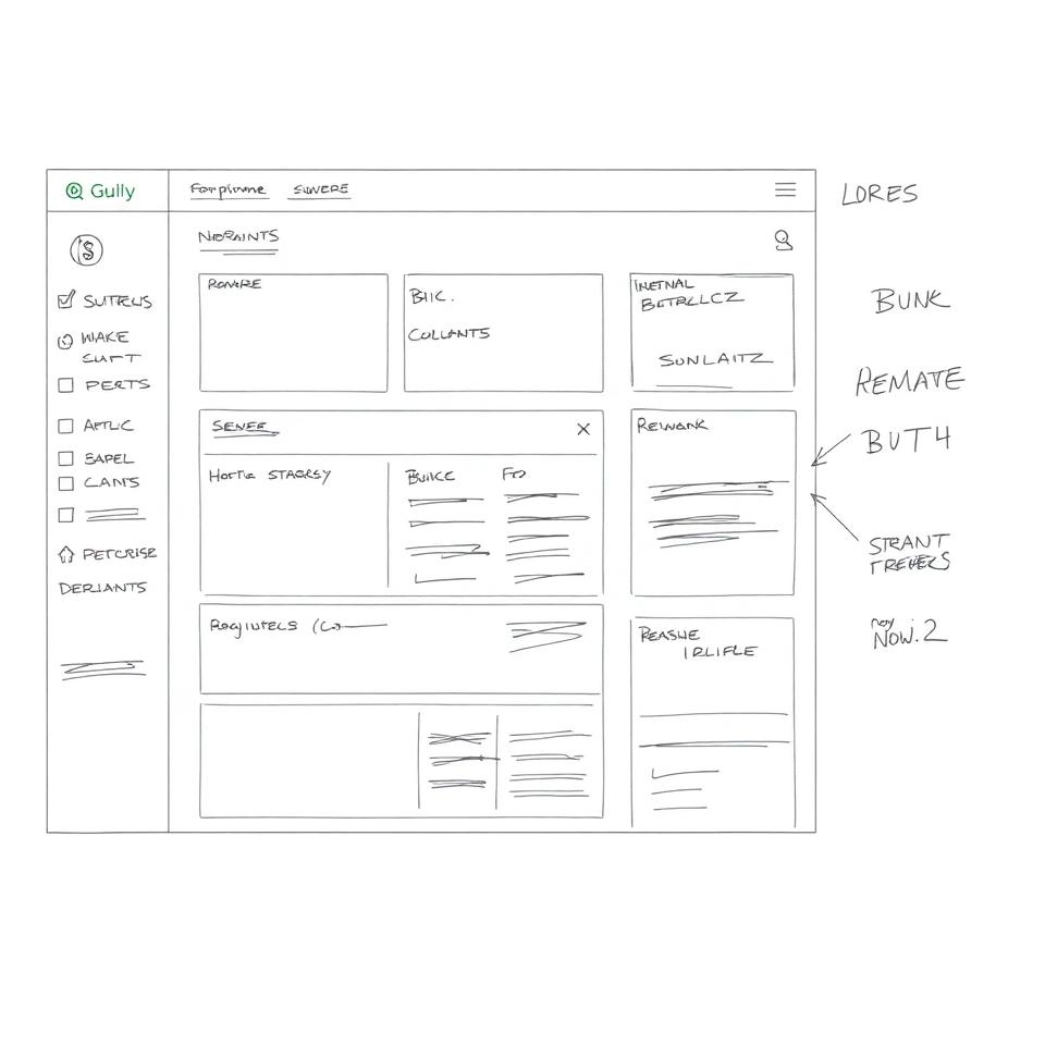
Ideation & Design Process
I restructured the information architecture and navigation first, then designed the core workflows and data views around it, prototyping in Figma so flows could be tested before build.
I worked iteratively — designing dense data tables, overviews and task flows that stayed legible and accessible even where the underlying processes were complex.
06
Collaboration
I worked closely with developers to translate the design into UX specifications and a clear handover, making sure the intent survived implementation within technical constraints.
I facilitated alignment between business stakeholders and the development team, using workshops to agree on priorities and keep a cross-functional group moving in the same direction.
07
Solution
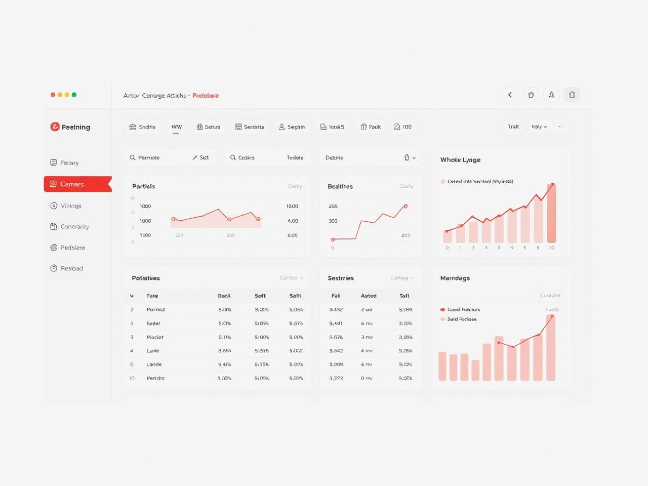
The result is a modernized partner portal with a clear information architecture, task-based navigation, and data views that make complex workflows manageable.
The UX rationale is consistent throughout: reduce cognitive load by structuring the platform around partner tasks, and keep dense information accessible and scannable.
- Architecture
- Task-based IA and navigation
- Data views
- Dense information kept legible
- Accessible
- Usable under real-world complexity
08
Impact
The redesign moved the portal from a legacy, hard-to-navigate system toward a modern, user-centered platform, with UX specifications handed over to development.
For partners, the portal becomes a tool that supports their work rather than getting in the way. For the business, it establishes a clearer, more maintainable foundation for the B2B relationship.
- Modernization
- Legacy portal to user-centered platform
- Delivery
- UX specs handed to development
- Foundation
- Maintainable base for the B2B platform
09
Reflection
What worked well: leading with information architecture and real partner workflows meant the redesign simplified genuine complexity instead of just restyling the surface.
The main challenge was balancing the richness of the data and workflows against clarity and accessibility. Future improvements would validate the restructured flows with more partners and refine the densest views based on their feedback.